A match made in heaven - the union between orange and blue reaches new heights
Think way, way (way) back to school days in the art room, and one of the first things you learn about, after ‘this is a paintbrush’, is the colour wheel.
As your teacher tries to explain the differences between primary and secondary colours to a class more interested in how every colour mixed together eventually makes brown, the theory of colour starts to click in the young subconscious, where, like a small mural painted with acrylic by a five-year-old on the dining room wall, it will stay for life.
It’s a simple notion: every colour has its opposite yet entirely complementary colour. So, it is perhaps surprising that so many people neglect this key design principle when styling their homes.
The King and Queen of this colour-match theory are surely blue and orange, although their history as a couple took a while to build, admittedly.
20,000 years ago, chances are your primitive eyes wouldn’t have even been able to see the colour blue, much less give it a name. It’s thought that we needed some extra time with evolution before the pigment began to stand out, with nothing at all mentioned of the colour in any ancient texts until the Egyptians – it’s always the Egyptians – created the first known artificial blue for artistic purposes in around 2,200BC.
Of course, orange has always been an abundant colour in nature, with fruits, vegetables, flowers, animals and certain types of soils all dressed up in the hue. Cave paintings are famously works of orangey-brown clay, while the Impressionists like Monet, Manet and Renoir used the colour to elicit warmth, excitement and amusement in their work, often against the blue of water in the background.
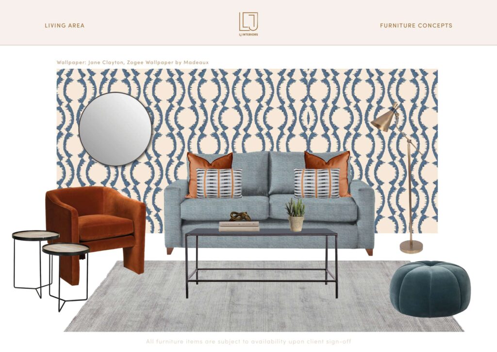
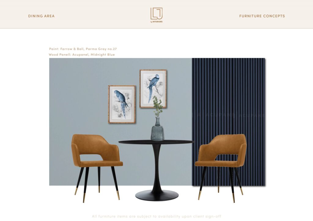
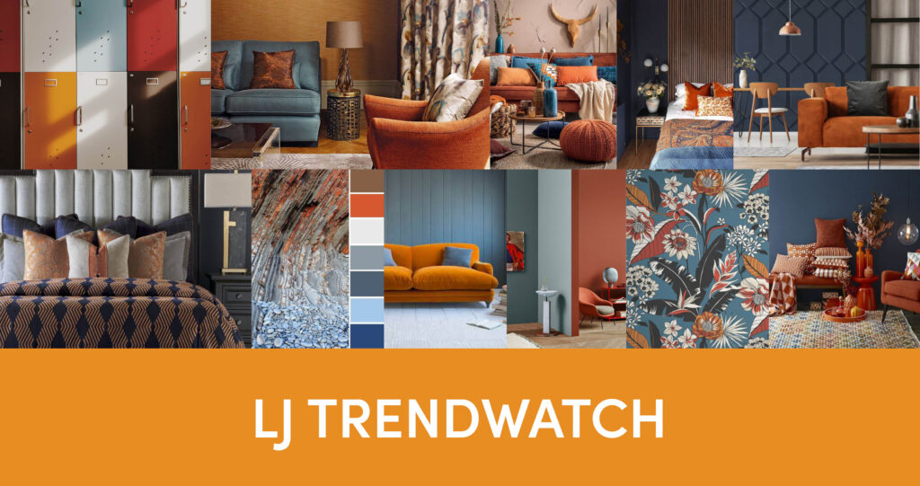
Since then, the great and the good of art and design have been combing the two colours to dazzling effect, and we can show you no better modern example than a recent bespoke project by our fabulous designer Amy, who has curated a series of evocative mood boards.
Amy has elevated and sophisticated the palette by combining the specific colour of the moment – burnt orange – with a muted blue-grey, creating a perfectly balanced interior scheme across texture, pattern and tone. It’s the kind of calming environment every paint-splattered art teacher yearns for at the end of the day.
Each bespoke project we take on is tailor-made to your brief, property specifications and most importantly, budget. Design is always at the core of everything we do, starting with a mood board to gauge the feel you want.
If you are intrigued by what you see and want to find out more, we’d be delighted to hear from you. Feel free to drop us a line with your plans or give us a call. All our contact details are below.


