

1. Night Watch Green + Rose Pink

Pink and green are a popular blend that brings the vibrancy out in any room. It can be especially effective when using the 2019 ‘Colour of the Year’: Night Watch Green. This deep tone brings an air of sophistication but can also feel oppressive if used in small rooms, so we’d suggest using this in living rooms and open spaces and pairing Night Watch Green with a bright Rose Pink to stop the area from feeling too dark.
2. Aquamarine Blue + White
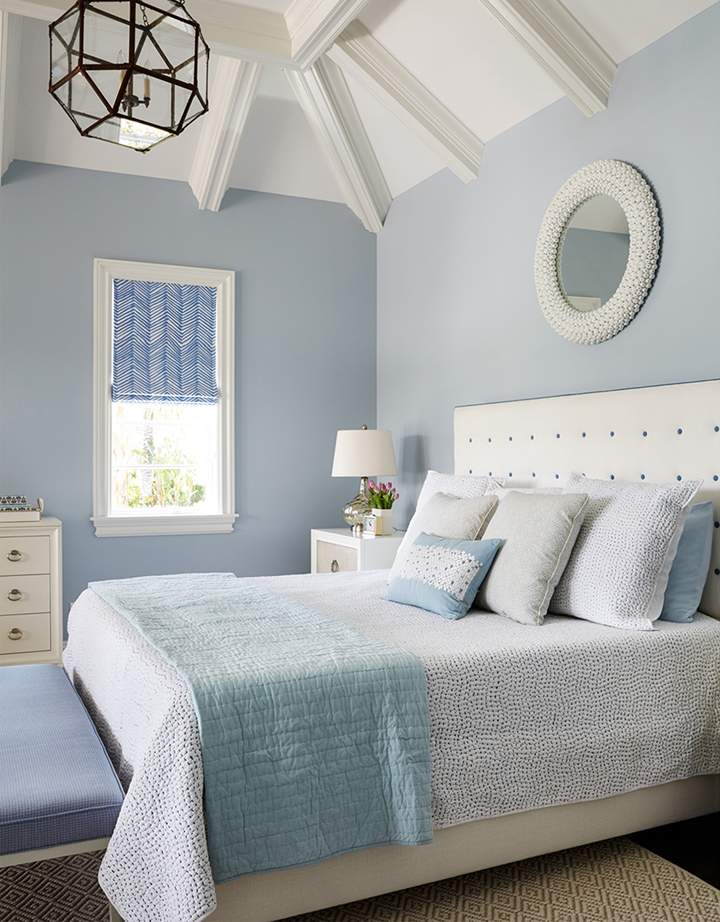
If you want to embrace a seaside vibe in your decor then pairing a pale blue with white will help create a calming, oceanic experience. Not only will it make your room feel bigger, but embracing cool colours in your home is proven to relieve stress. Whether you live by the ocean or not, an aquamarine and white combination – especially for a bedroom – won’t go wrong.
3. Turquoise + Tangerine

If pale tones don’t appeal to you, and you’d rather go for something bolder, then combine the contrasting colours of turquoise and tangerine. These sharp, poignant colours will attract the eye and create a bold statement without coming off as garish. Orange/blue contrast is massively popular, and you may not even realise it. Film posters and advertisements use it all the time, as the contrast between hot and cool colours
4. Blue + Gold
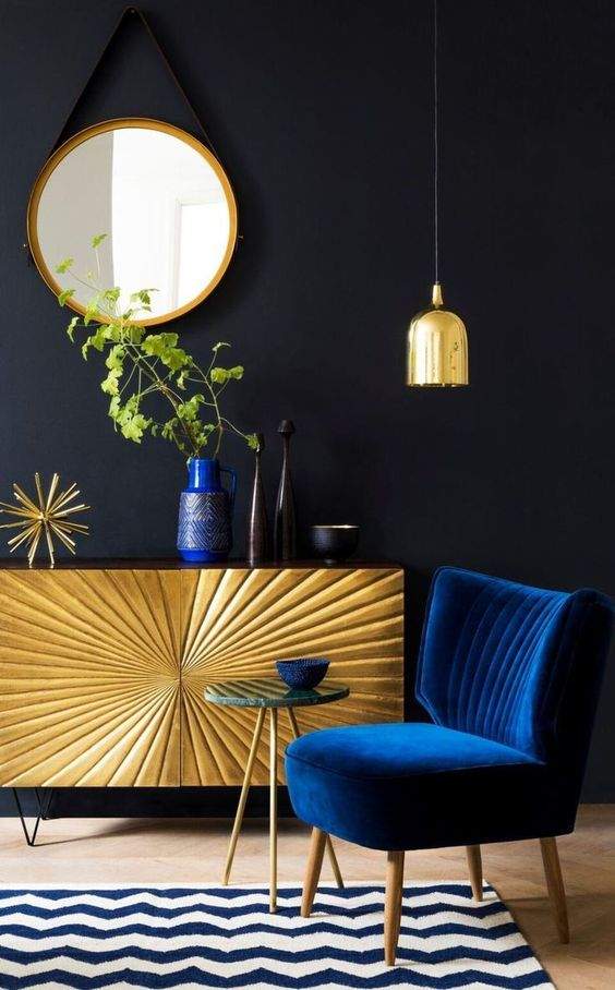
This is one of LJ Interiors’ go-to colour combinations if we want to bring a feeling of luxury to a staged property or apartment. Anything with gold feels expensive, but when paired it with a deep blue helps it feel both regal and personable. It’s a classic combo that rarely fails to impress, especially if you have a minimal budget, as it will appear more costly than it actually is.
5. Pale Lilac + Muted Grey

If you want something more feminine but not overly colourful, we suggest a pale lilac and a muted grey. Once you strip the saturation from the vibrant purple and pinks and pair with a soothing neutral tone you’re left with a welcoming atmosphere that would be ideal for a
6. White + Wood
You can never go wrong with white interiors. They’re welcoming, make any room feel larger, and go well with every other colour. If you want to make white the main focus of your room, take inspiration from
7. Burgundy + Lavender

For something colourful and sleek, try to stick with the purple end of the colour wheel. Take a deeper burgundy and pale lavender and see how well they mesh together. Purple tones instantly give an impression of luxury, so it’s another easy way to make
8. Red + White
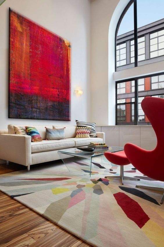
Finally, we have another combination that utilities the most accessible colour: white. However, if you think having too much light space is a boring we suggest adding red moments across your room. But don’t go overboard! Red can feel overbearing when used excessively, so we’d recommend sticking to a red signature sofa or wall art to make a bold state and help bring life to your room.